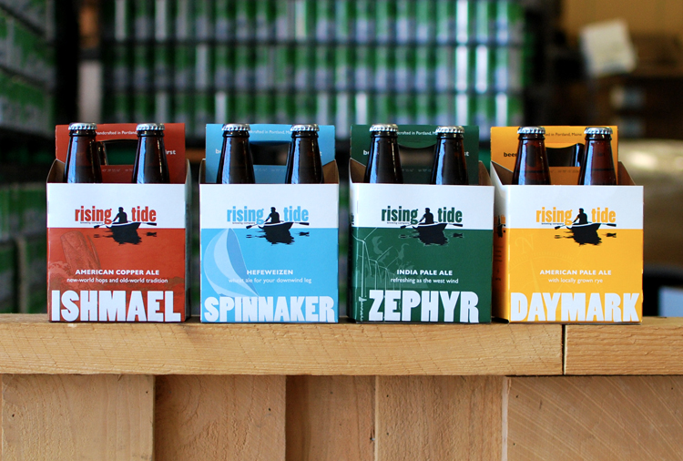
Client:
Rising Tide (brewery)Design/Art Direction:
Might & MainParticulars:
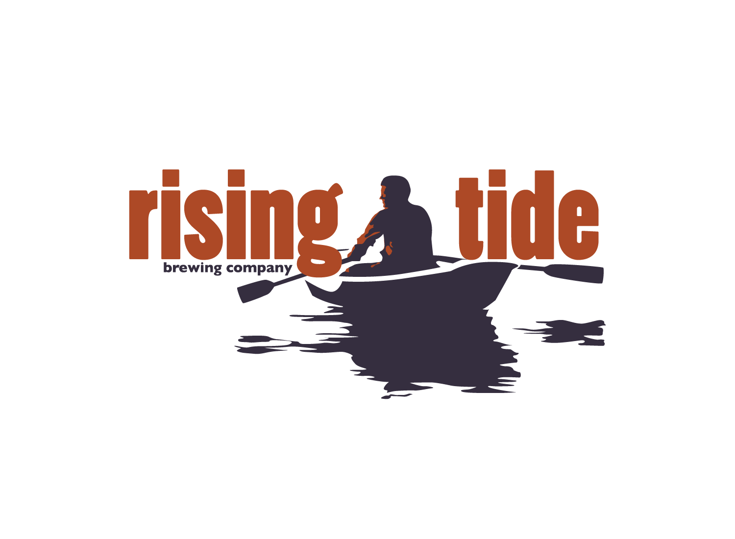
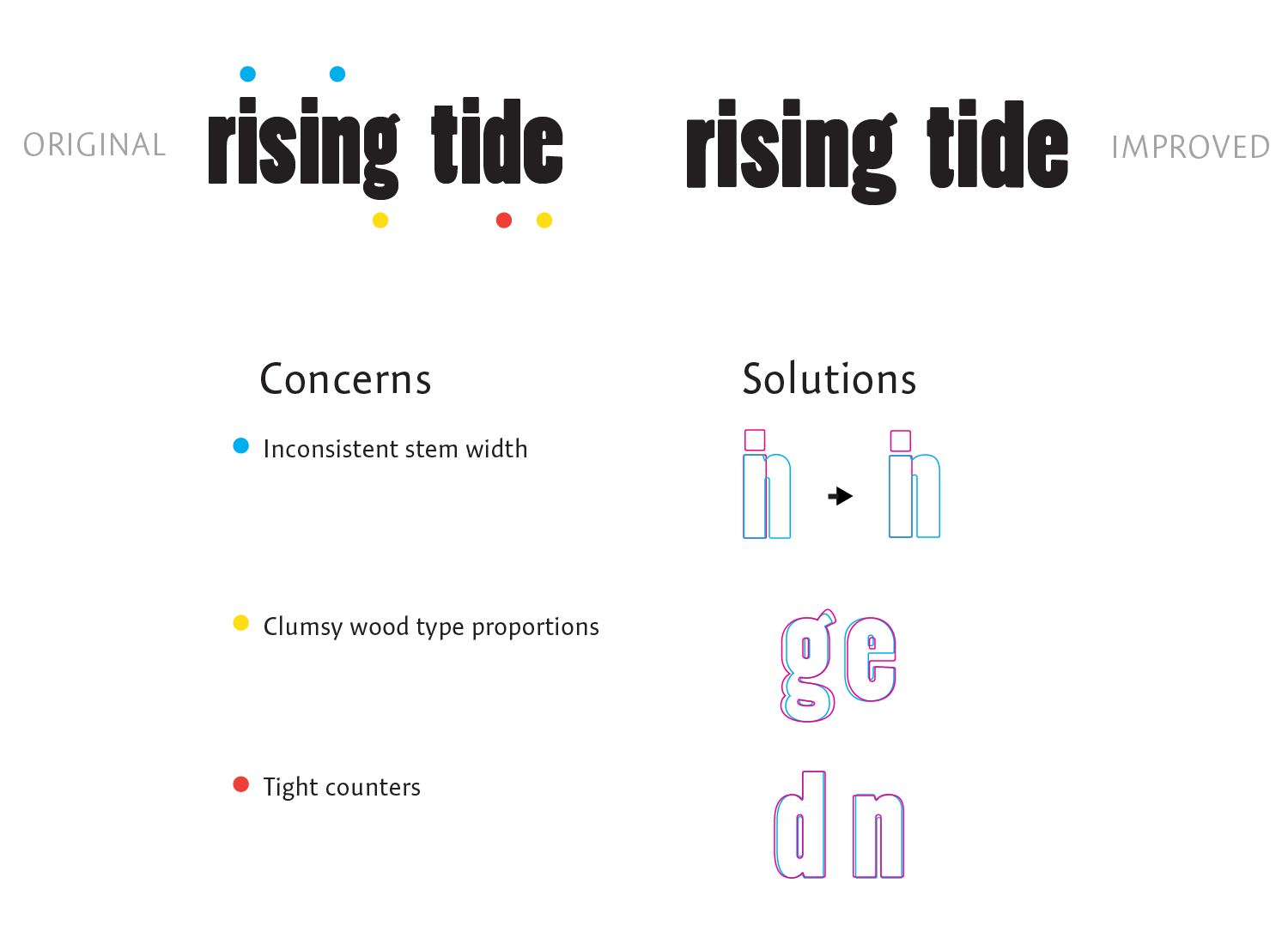
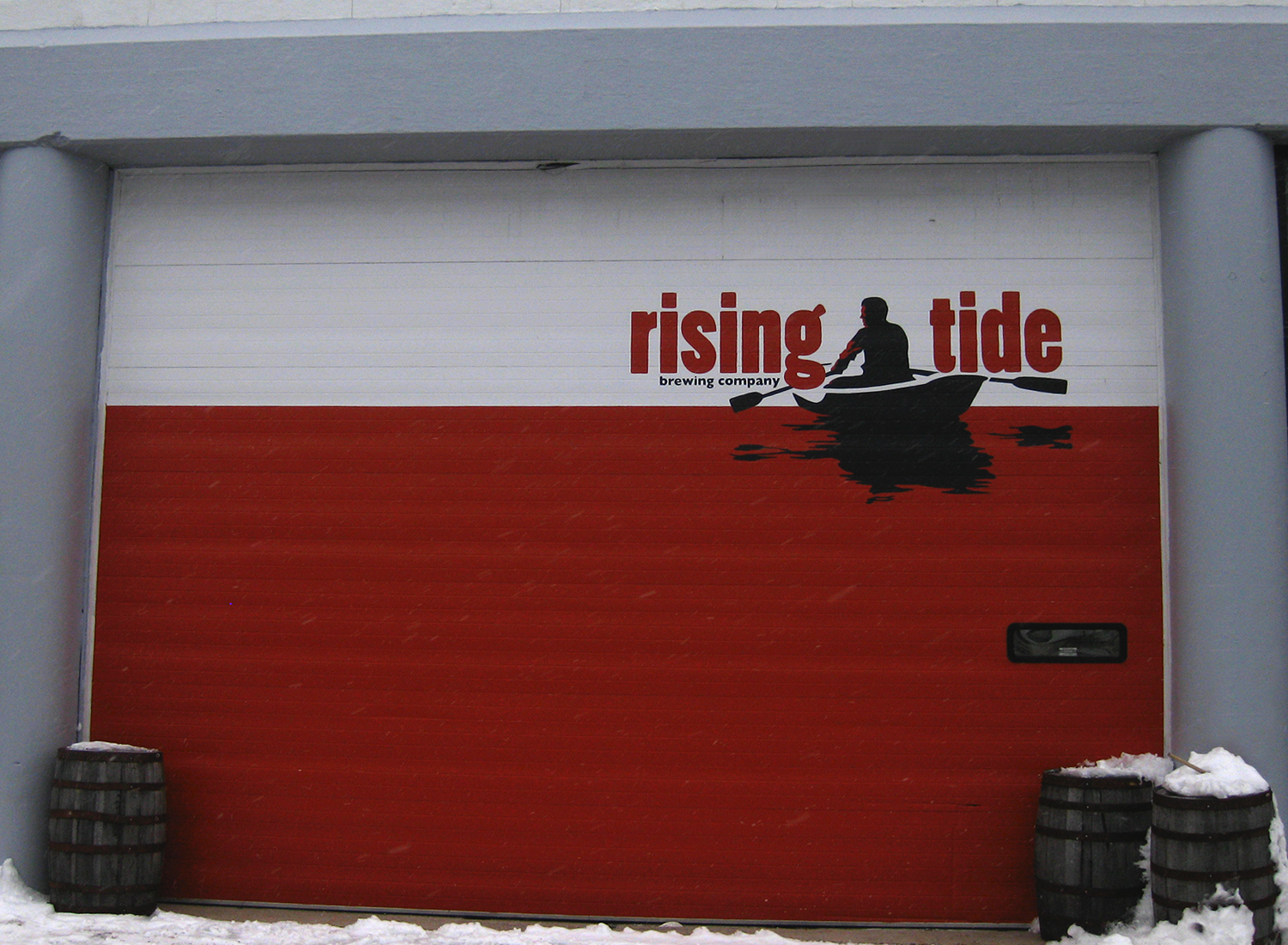
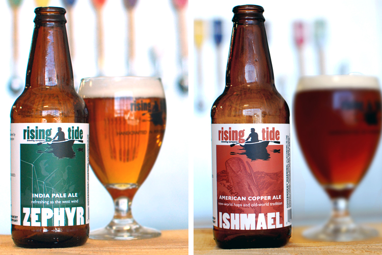
In preparation for their bottling endeavor, Rising Tide asked Might & Main to tidy up their logo and work on their packaging. The original logo was designed using Poplar, which is a digitized version of a wood type. Like many wood type designs this came with certain eccentricities that are necessitated by milling the typeface into a physical piece of wood. These eccentricities were ironed out to make the logo more cohesive.