Client:
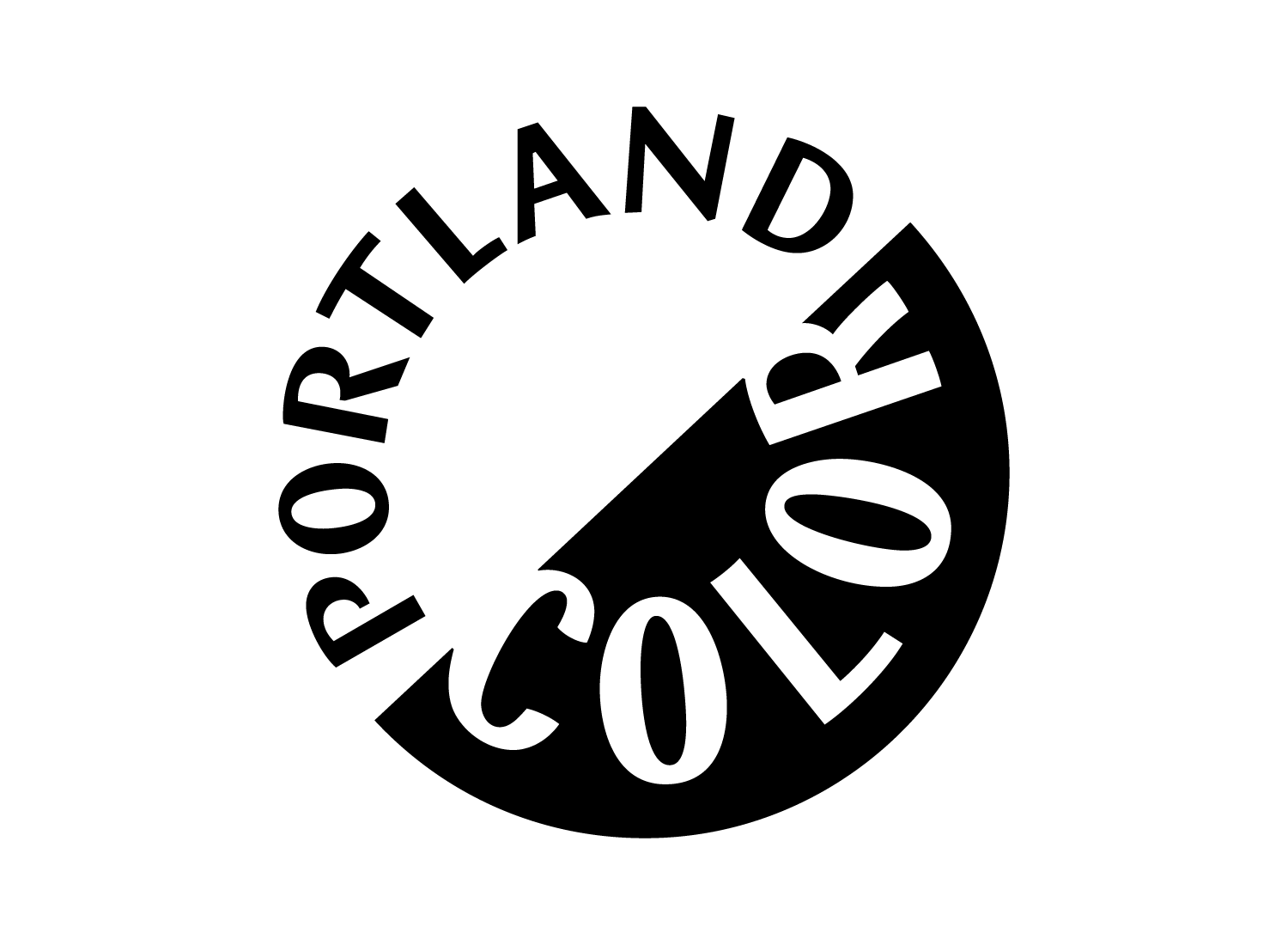
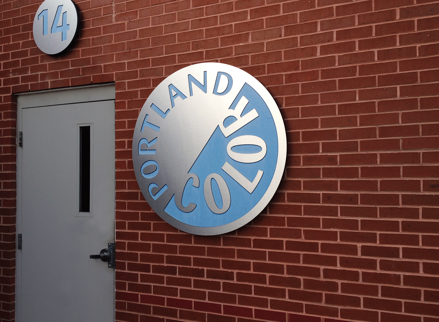
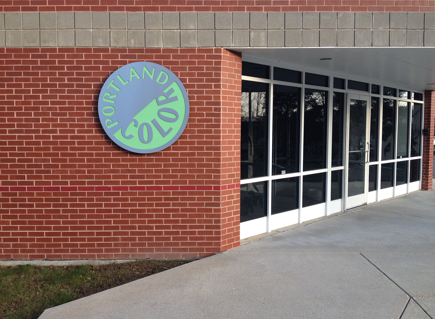
Portland Color (photo processing specialists)Design/Art Direction:
Mark Jamra with Margo Halverson of Alice Design Communication.Particulars:
This logo contains specially crafted letters which are designed to optically work on two arcs. The concept suggests the myriad rotational movements in film processing, and alludes to the old sign-painted letters on the Portland Color building on York Street. Given a luke-warm reception at first, the employees learned to love the logo because it could be used anywhere effortlessly. It also stood out distinctly amongst its competitors.